Common colors recommended by(display case)designers
The colors used in the design of the display case are varied, and the colors chosen are different according to the products and scenes. The matching between color and color is also very important. Warm colors will bring warm feelings, cold colors will bring cool feelings. Next, Detron Display will introduce to you the feeling brought by the color.
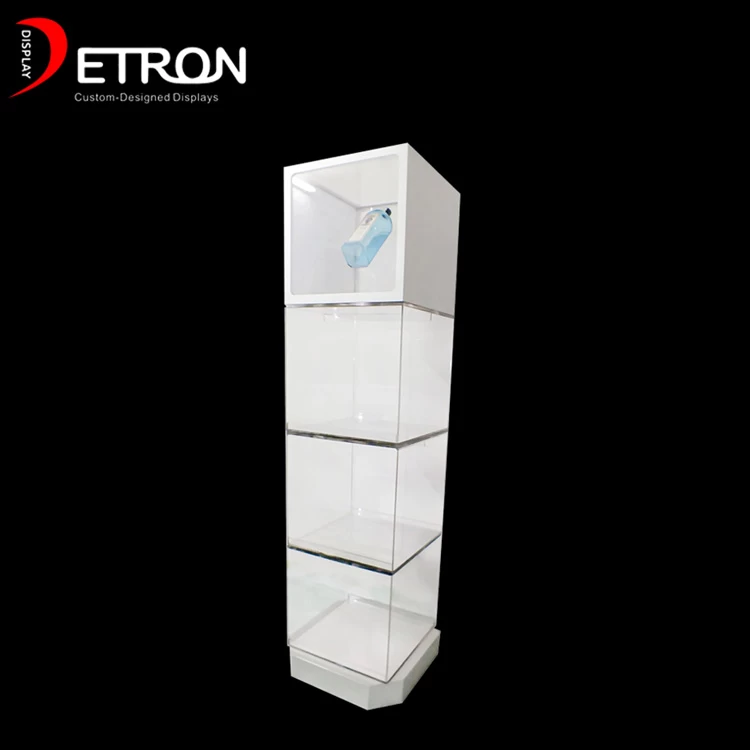
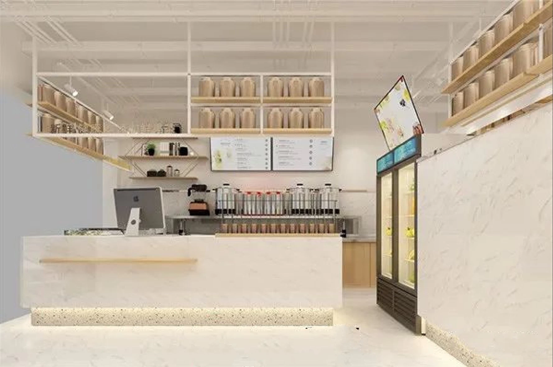
White: It will reflect all the light and has a clean and bright feeling. Therefore, in the store display cabinet planning, if the space is small, you can use white as the main color to increase the spaciousness of the space, the common color of the display cabinets in various industries.
Gray: is a very easygoing color, and any color can be matched, if the color match can not find the right time, you can try to use gray to reconcile. In the showcase design gray can be regarded as a representative of the color, is the common color of the industry showcase.
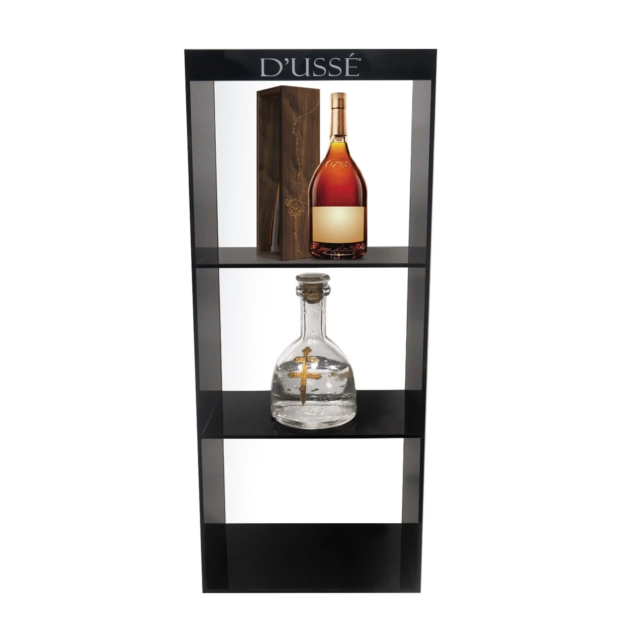
Black: this color often gives a mysterious feeling, is also dirty color, suitable with white, pink with, play an emphasis role, so that the display cabinet color more dazzling, is the common color of cosmetics display cabinet.
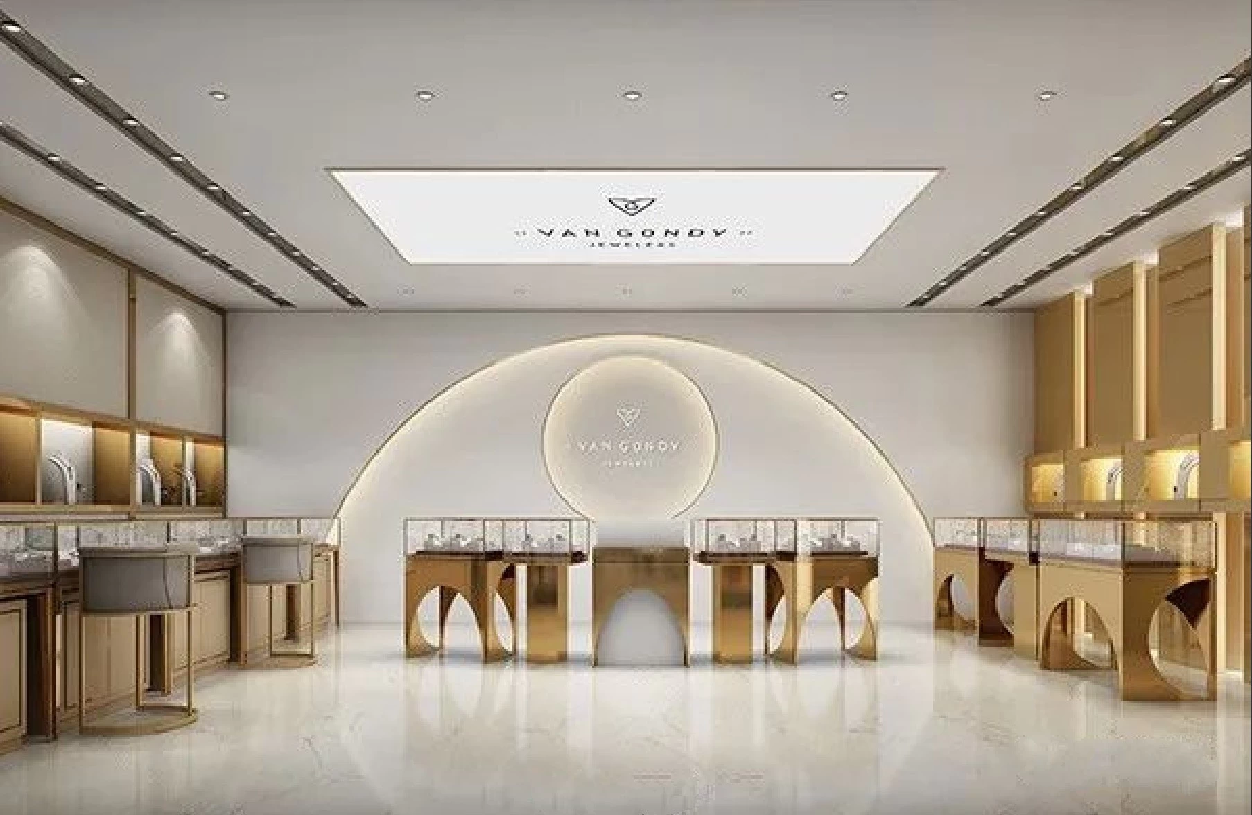
Gold: is a luxurious color, can send out a gorgeous dazzling light, so that people have a dazzling feeling, is the common color of the jewelry showcase.
Red: is a color with a stimulating eye, giving a sense of vividness and vitality. However, the use of store display cabinets should not be too much, easy to rob the product vision, is the color commonly used in superstore display cabinets.
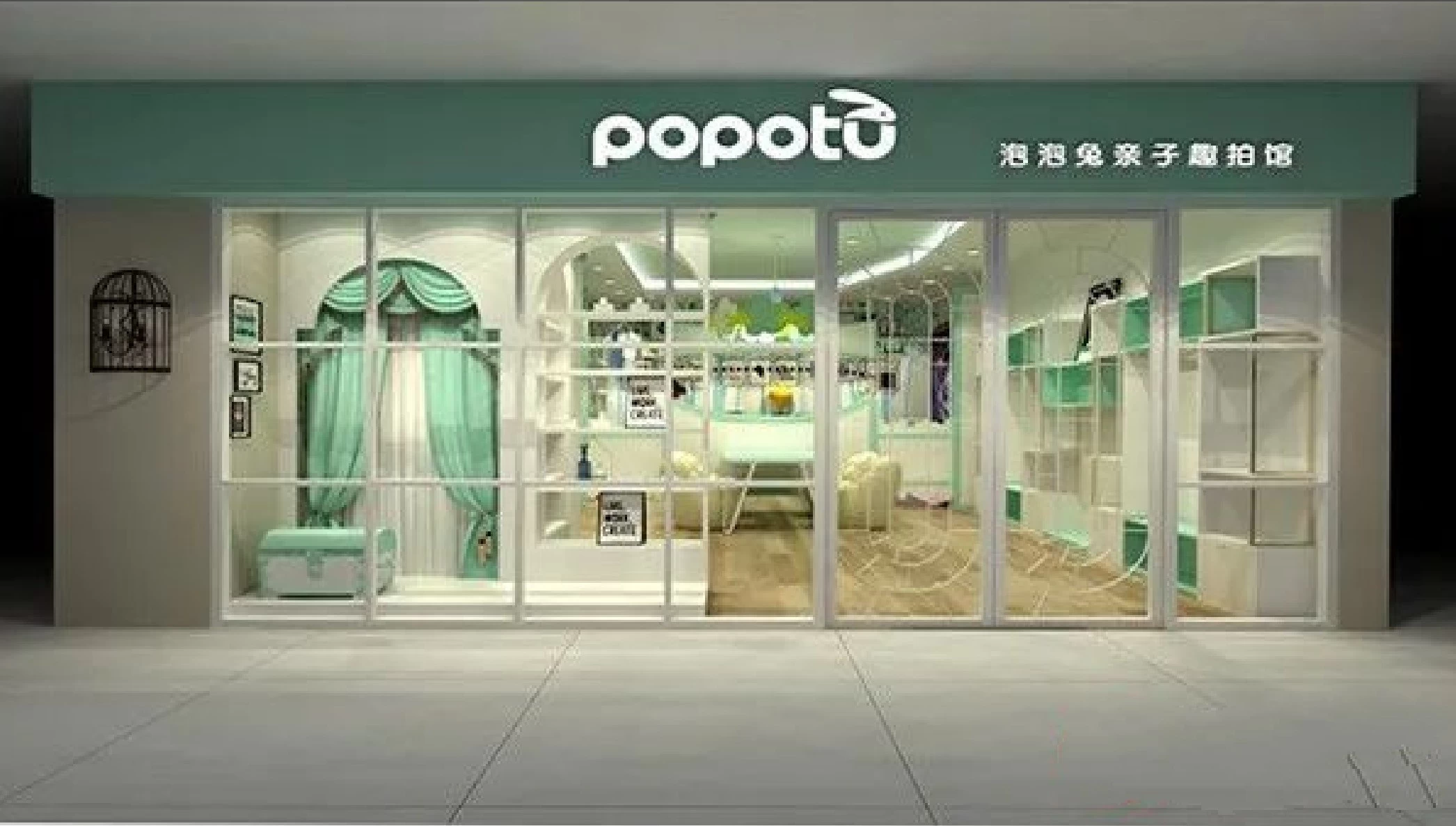
Green: It is a mild and comfortable color. Green also represents the vitality of health. Natural green on visual fatigue has a certain moderating effect, is the common color of children's clothing display cabinets.
Orange: It produces youthful energy and induces appetite. It is also the representative color in the warm color system and the color of maturity. It is a common color for snack food display cases.
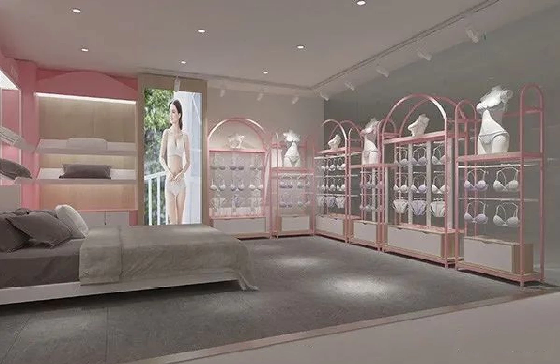
Pink: It is a gentle and lovely color, this red and white mixed color, simple and clear and bright, pink means as gentle as water. It is the color commonly used in lingerie store showcase
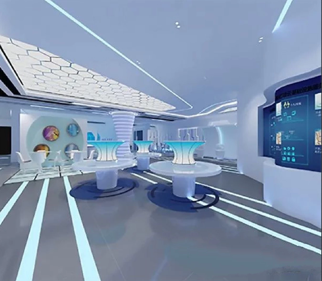
Blue: is a reverie color, it is a fashionable color, but also a color commonly used for technology elements, is a good match color, blue showcase also makes people feel elegant and quiet. It is the common color of electronic products showcase.
Yellow: It is a color that symbolizes health, it looks healthy and bright, also because it is the most easily absorbed color in the spectrum. It is a common color for milk tea store showcases.
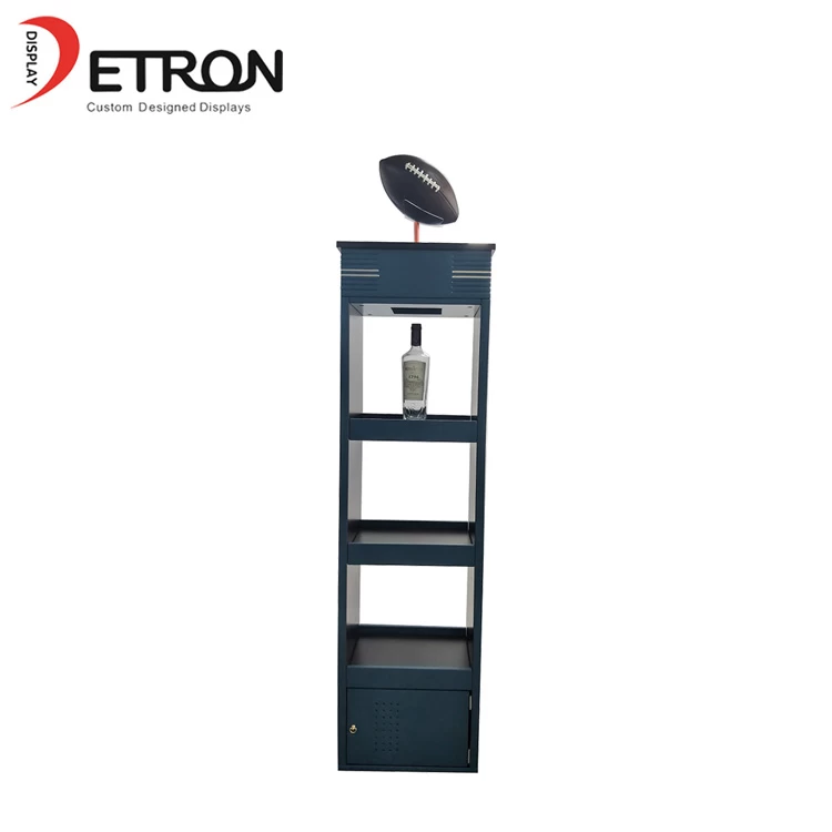
Brown:Easy to match the color, can absorb any color of light, is a comfortable and peaceful color, can be safely used in the home. It is a common color for tobacco and wine display cabinets.


